Design Insider
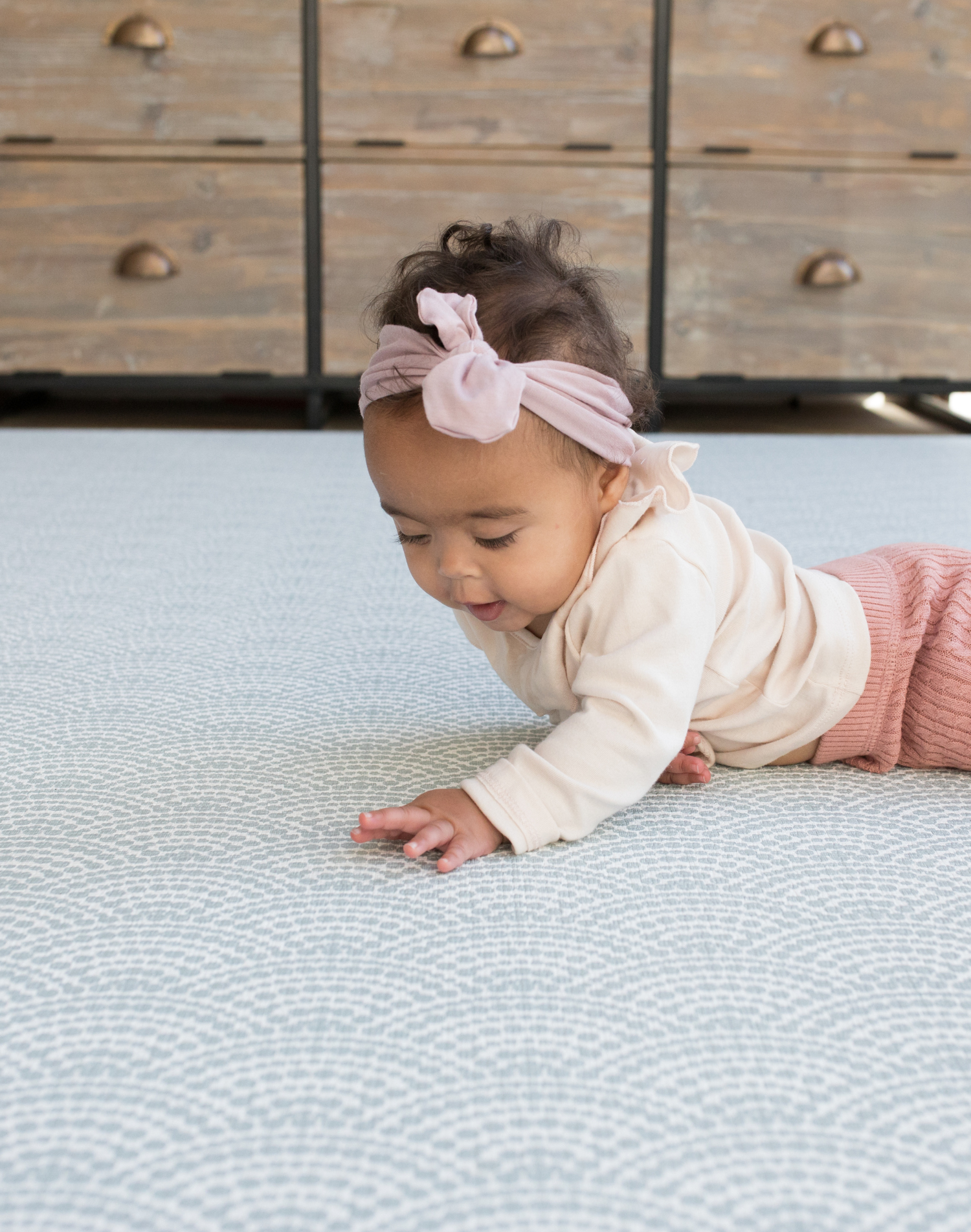
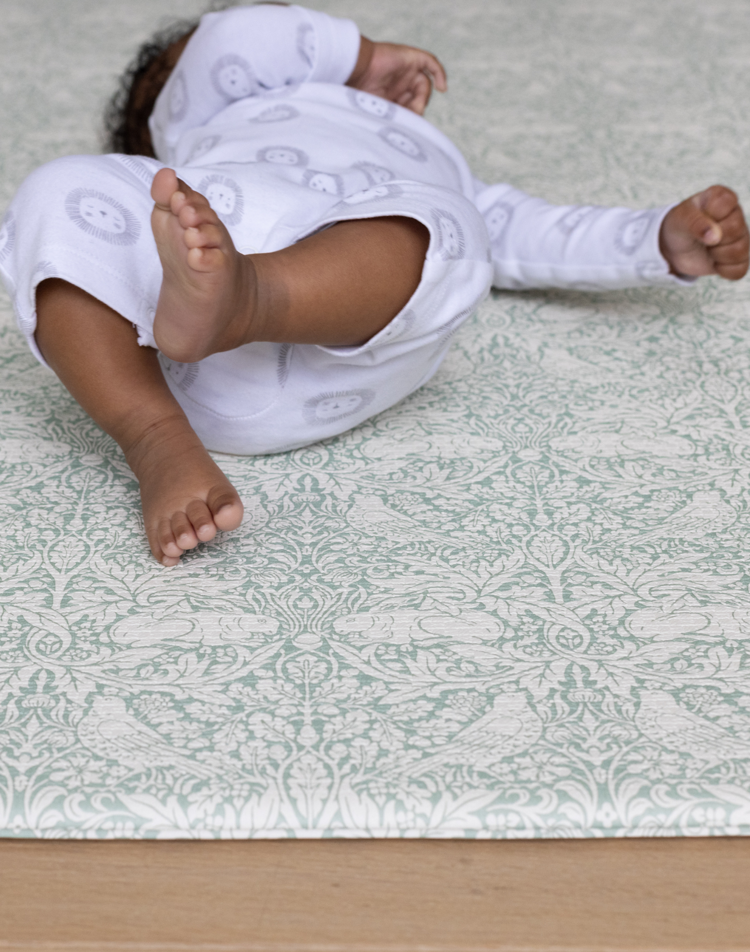
Having lots of choice is both a plus and a negative - it can make choosing harder! Totter + Tumble playmats are made to fit in subtly with your interior, so finding the right one for your home is imperative.
Here we give you the inside scoop on the designs, and show you the different playmats side by side, so you can see your grey from your gray, and your seagrass blue from your iron blue.

As you may well know, Totter + Tumble currently stocks 16 designs across eight reversible playmats. Both the colours and patterns have been carefully designed with interiors in mind, but that they can remain subtle within a room setting and fit into a wide range of interior styles, to allow play to remain focused.
Picking the right design for your home can be a tough decision, so this article uses a series of photos to help you compare the designs and the colours, so that a Totter + Tumble playmat can be an asset to your well-considered home style.
Let’s Talk About Grey
So grey is grey, right? Wrong.
Whilst we tend to think of grey like a mix of black and white paint, grey can actually be produced by mixing primary and complementary colours together, giving greater warmth or depth depending on the colours chosen.
The three common undertones to form a grey are blue, green and purple which help to create both warmer tones and cooler tones. The guide below will help you to visualise your playmat against your floor, against your wall colour and with the room in general.

The Globe Trotter, The Roamer, The Nomad, The Trailblazer
The Trailblazer, on the far right, is an example of a grey formed using a touch of purple as the undertone, and is often the case with marble greys, the stormy cloud greys, the dusty greys. It can be a bit of a chameleon, appearing cooler or warmer depending on the balance of tones and the lighting in your home.
Greys formed with a blue undertone create the standard, well known cool grey: the pencil grey, the black and white paint grey, the steel grey, the #hinchhome grey. It is a very flexible tone, that matches well with other cool, fresh colours as well as bolder, dynamic colours. This encompasses the grey of The Nomad and the slightly fresher The Thinker playmat.

The Thinker and The Nomad
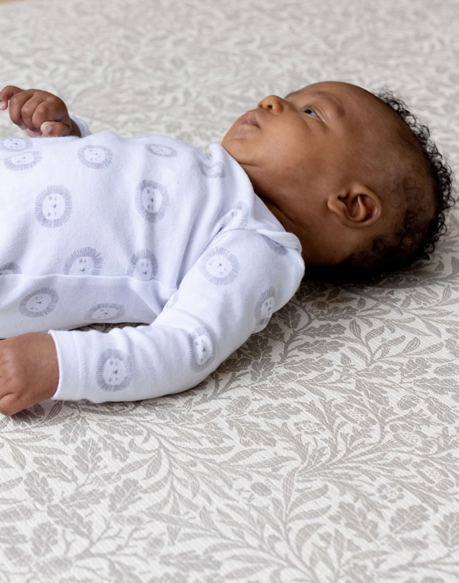
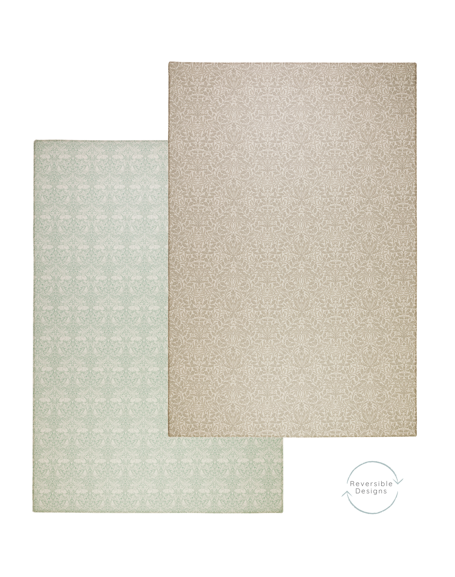
Greys formed with a green undertone create warmer greys or Pantone Gray, all the way to creams and greiges, depending on the yellow contingent of the green used. The dove greys, the taupes, the Cornforth White to the Elephants Breath are all examples. These greys are great with a softer interior palette, with earthier, chalkier tones, and which we adore in The Roamer as well as the slightly lighter The Globe Trotter.

The Globe Trotter and The Roamer
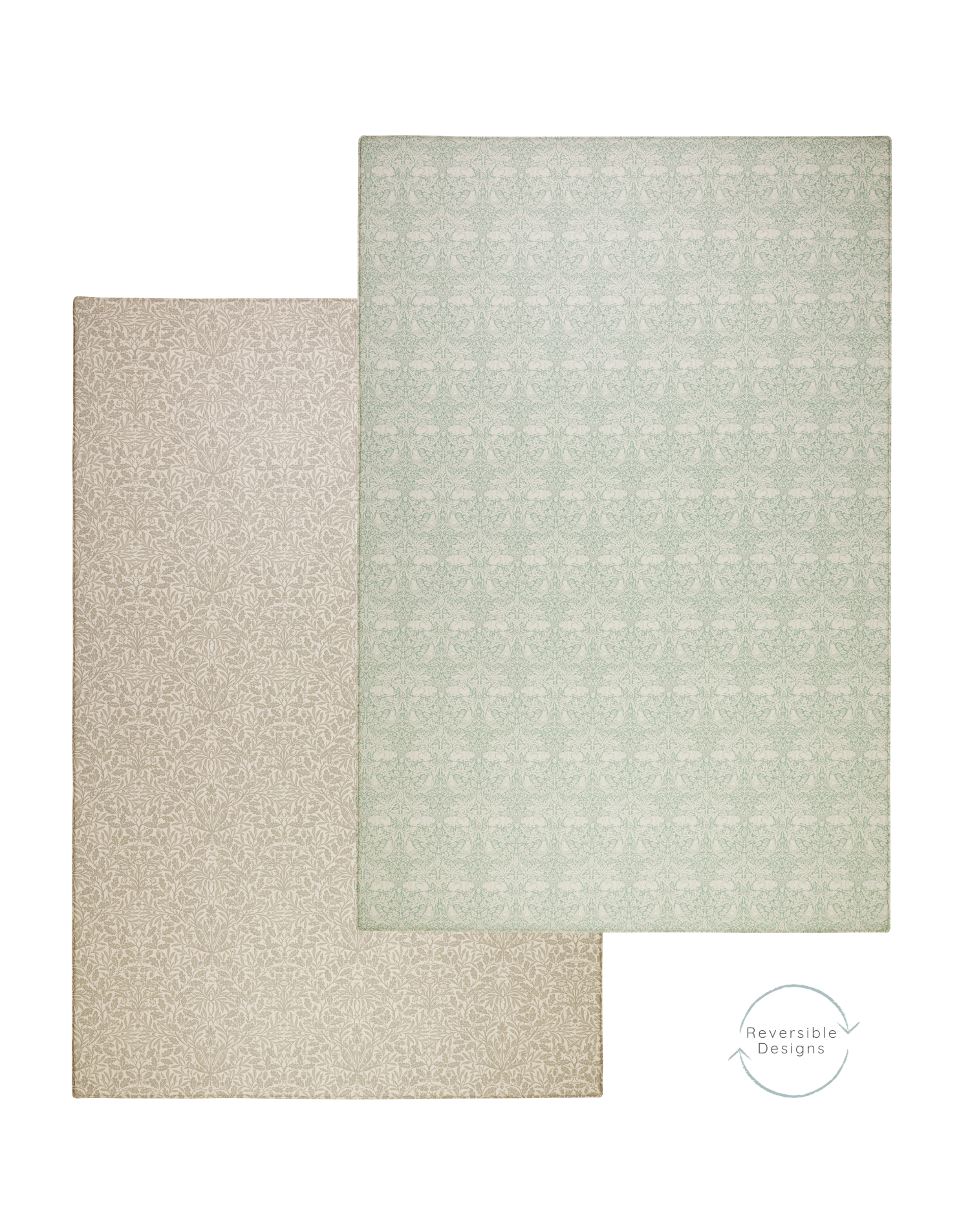
And don’t forget The Wanderer; a greenish-grey which is fabulous for injecting a fresh light into your interior. Seen below in the green section and in comparison of the vintage chevrons.
Let’s Talk About Colour
But our playmats aren’t all grey. We have a number with gentle colours to complement and accent your spaces.
Adding Tones: Blues and Greens
In the home, blue shades are immediately welcoming, whether used in a deep tones for a touch of drama, or a more subtle tone. Green is also incredibly calming in interiors and is often used to draw different shades together. Whether blue or green is for you, five of our designs may be the perfect one for your home.
The Mariner, The Seafarer, The Wanderlust
The Mariner playmat harnesses the elegant scalloped dot pattern of The Seafarer with a lighter, brighter alternative, balancing blues and greens with a Seagrass colour in the forefront of the design and a pale background to give it an all-round lighter feel
Though now paired with our honey mustard Keeper, The Seafarer is from our original collection due to its versatility in design. With an iron-blue background to the warm grey scallops, this design has a darker overall effect.
And for a deeper hue, our Wanderlust playmat is a midnight teal, balancing blues and greens, and work beautifully as an accent in a lighter interior or blending into a more sumptuous, moody space.

The Mariner, The Rambler, The Champion, The Wanderlust
The Champion, new to our 2020 Collection is also darker design, though its ditsy scale and hints of dark greys and greens, give it longevity in interiors.
For a purer green, the fresh sage of The Rambler and the intricate botanical design are great for adding a little bit of detail. Though imagined in more traditional styles of home, you have shown us how it blends beautifully into modern interiors too. Seen here next to the light greenish-grey Wanderer.

From the top: The Rambler and The Wanderer
Pinks, Oranges and Reds
The past few years have seen a resurgence in pinks, oranges and reds for interiors. From Farrow & Balls hit Setting Plaster, Persian textiles and deep earthy tones, we have seen them across our favourite insta-homes as well as in interior magazines.

The Friend, The Captain, The Dreamer, The Keeper
If you love Setting Plaster by Farrow & Ball, The Friend is likely to be the playmat for you. With a touch of yellow in its base, our plaster pink Friend adds warmth. It is this element of its design that makes it nestle beautifully into traditional interiors. It’s the perfect, non-candy pink for contemporary homes.
Moving along the scale, The Captain harnesses lots of warmth in its softened terracotta hue. We fell further in love with this design as it complemented the interiors at our most recent photoshoot, sitting beautifully with rustic décor as well as Persian textiles.
If you just want a hint of colour, the coral Dreamer and the honey-mustard Keeper, with their pale backgrounds, are a subtle way to introduce a colour pop, especially if there is another colour taking centre stage in your interior.
Let’s Talk Patterns:
Perhaps you aren’t trying to find the perfect shade of colour, but have fallen in love with a patterned design. You may be dotty for the spotty Scout or wild for the leopards of The Champion or The Trailblazer. You may be taken by the beauty of the Kilim inspired playmats, or the tranquillity of the scallops. Here is a quick gallery for you to compare the different colour ways of our designs.
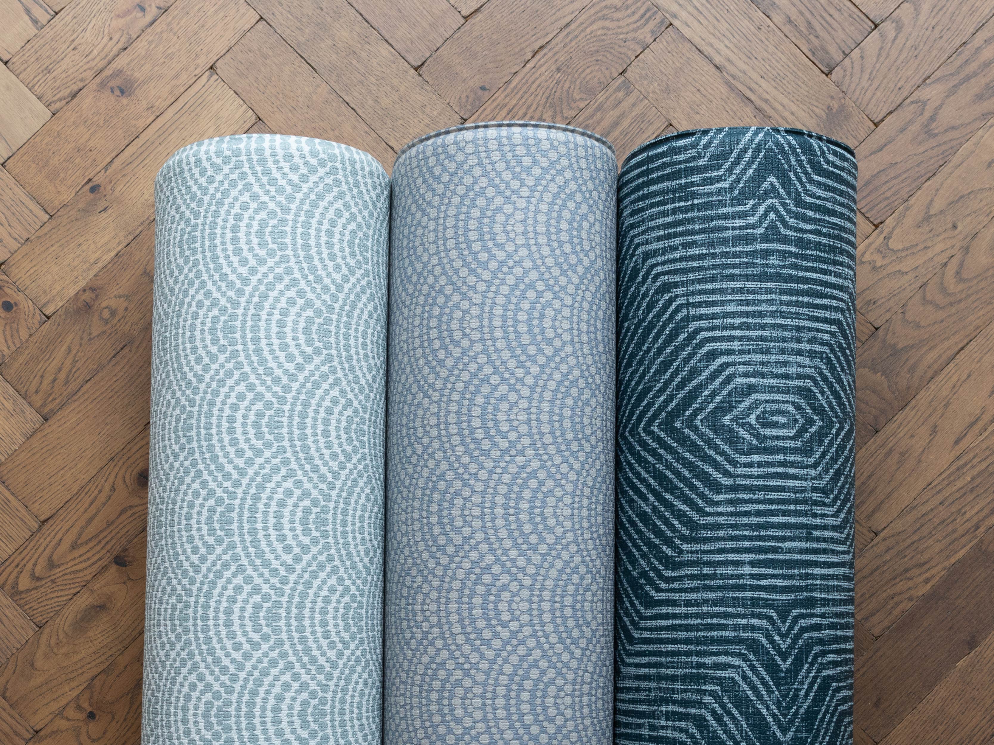
 The Champion, The Trailblazer, The Scout

From the top: The Globe Trotter, The Friend, The Captain, The Wanderlust

From the top: The Mariner and The Seafarer

The Dreamer and The Keeper

The Rambler and The Thinker

The Wanderer, The Nomad, The Roamer
Still can’t make your mind up?
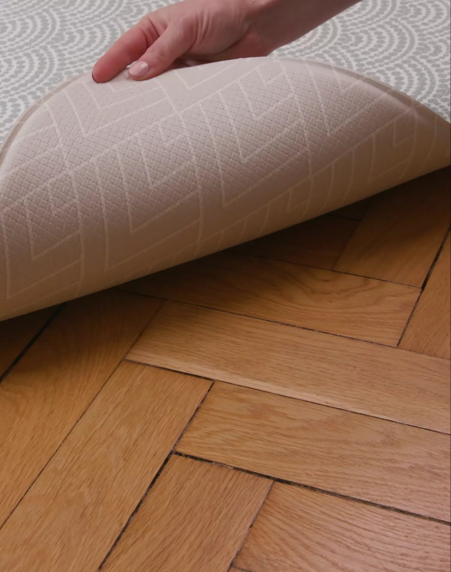
If you live in the UK you can order up to two little pieces of your favourite reversible Totter + Tumble playmat to try out in your own home and get to feel the quality up close.
We seek to make our Swatch Service as sustainable as possible, and therefore provide refunds for the cost of the swatch on return so another family can get use from it as well. For full details, check out our Swatch Service here.